Phase 1 · Website homepage prototypes

Hello Sir homepage options

Six distinct directions for the customer website homepage. Each one covers location-based service discovery, a booking call to action, services, how it works, trust and safety, reviews, city coverage, FAQs and app links. Open a prototype to try it at any width; the screenshots show desktop (1440px) and mobile (390px).

All copy, prices, cities, therapist names, ratings and reviews are labelled sample content. Photos are real stock images from Unsplash, used for review until the client supplies approved photography. The location check uses a mock list of cities (try “Kolkata” or “Pune”). These files are prototypes only and are separate from production code.
Option 01

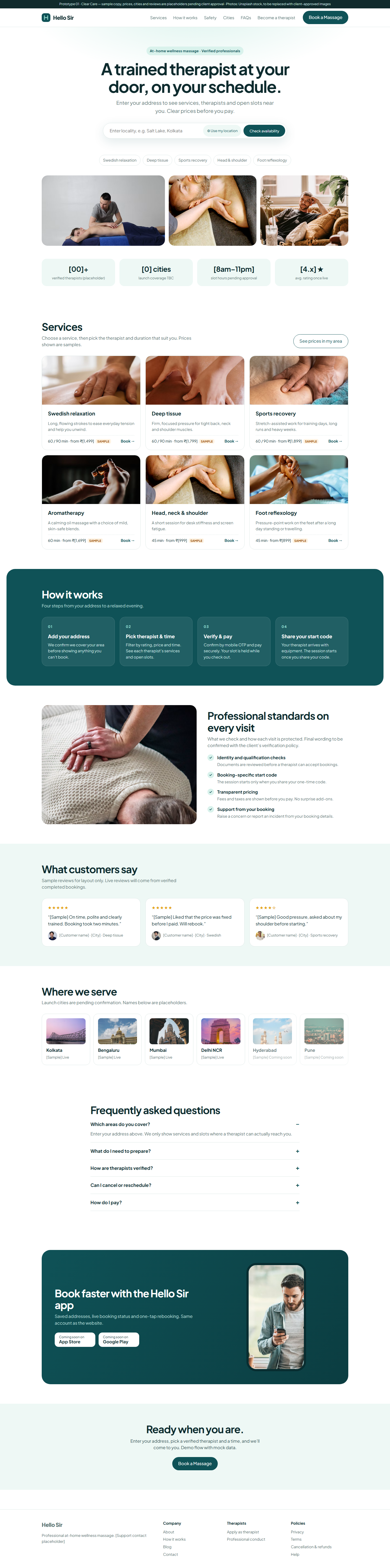
Clear Care

Clean, clinical-calm and centred on one big address search, for a brand that leads with trust and simplicity.

Palette
White, deep teal, mint
Type
Plus Jakarta Sans
Booking entry
Pill search bar with “use my location” in the hero
Best for
First-time customers who want reassurance
Option 01 desktop
Desktop
Option 01 mobile
Mobile
Option 02

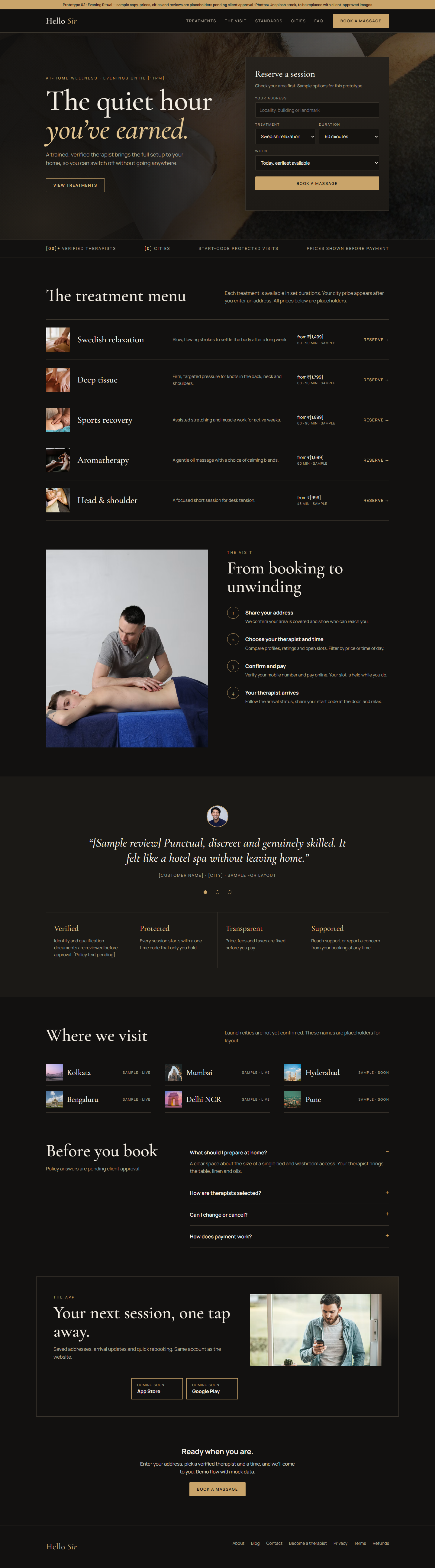
Evening Ritual

Dark, premium hospitality feel with a serif headline and a reservation card, positioning Hello Sir as a hotel-spa experience at home.

Palette
Charcoal, brass gold, cream
Type
Cormorant Garamond + Manrope
Booking entry
Reservation form (address, treatment, duration, when)
Best for
Premium pricing and evening bookings
Option 02 desktop
Desktop
Option 02 mobile
Mobile
Option 03

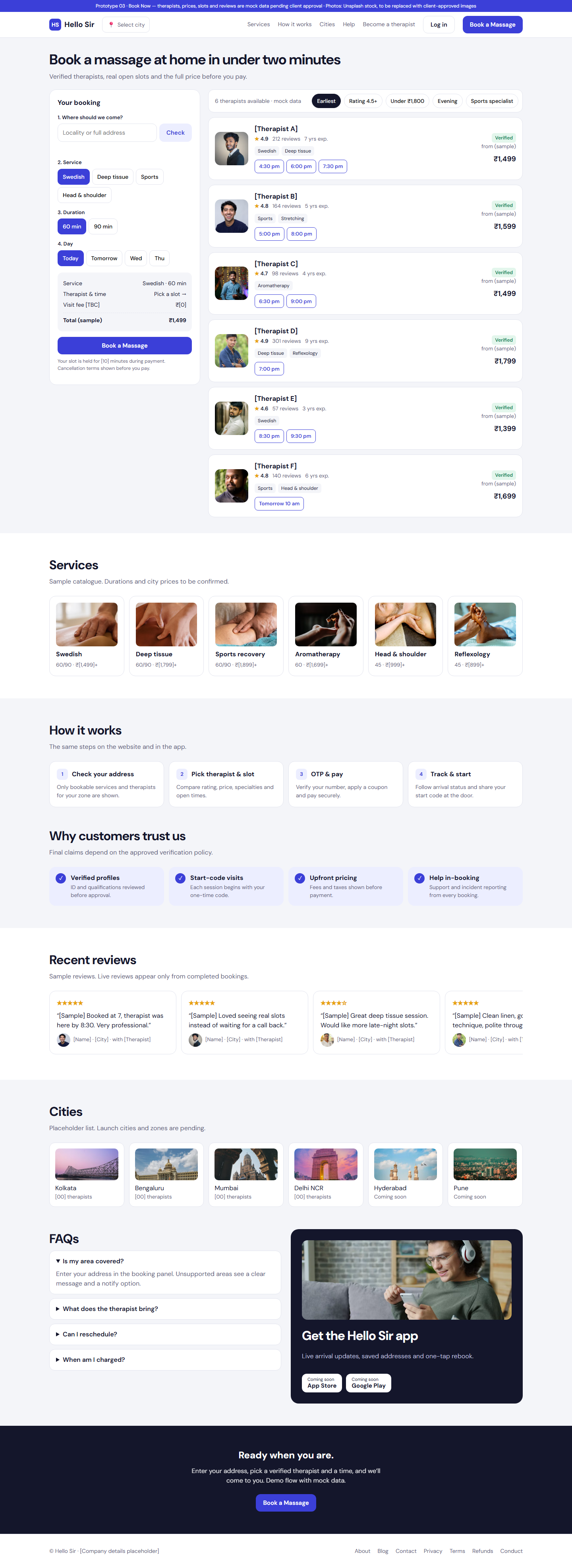
Book Now

Booking-first marketplace that puts the booking panel, therapist cards, filters and open slots above the fold, closest to the reference journey.

Palette
Light grey, indigo
Type
DM Sans
Booking entry
Step panel with live summary plus therapist list and slot buttons
Best for
Repeat customers and fastest conversion
Option 03 desktop
Desktop
Option 03 mobile
Mobile
Option 04

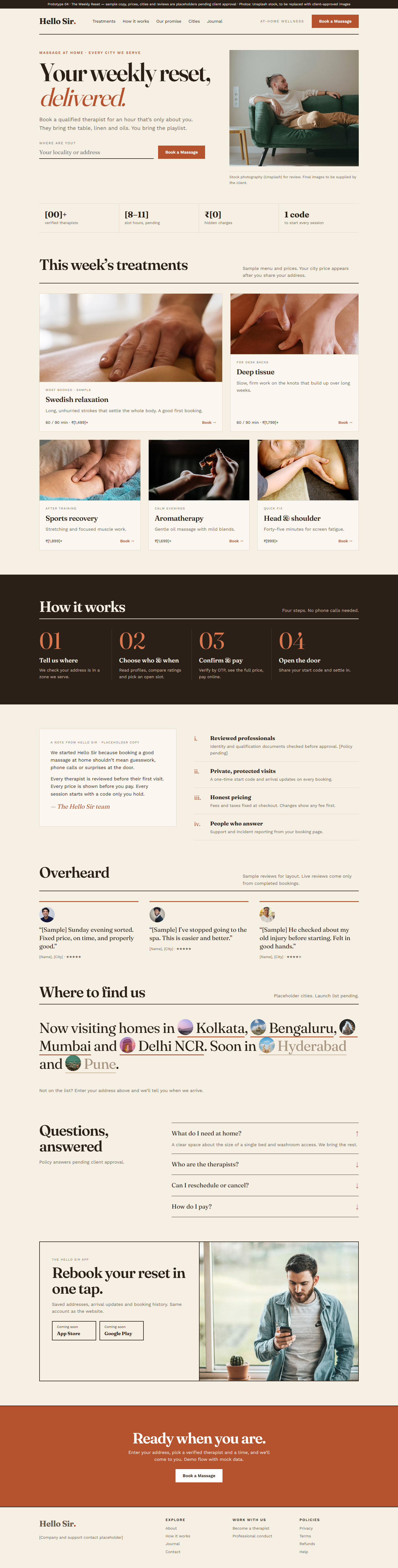
The Weekly Reset

Warm, editorial magazine layout with large serif type, a brand letter and pull-quote reviews, built around self-care as a weekly habit.

Palette
Cream, terracotta, ink
Type
Fraunces + Work Sans
Booking entry
Underlined address field with one strong button
Best for
Brand storytelling, blog and SEO content
Option 04 desktop
Desktop
Option 04 mobile
Mobile
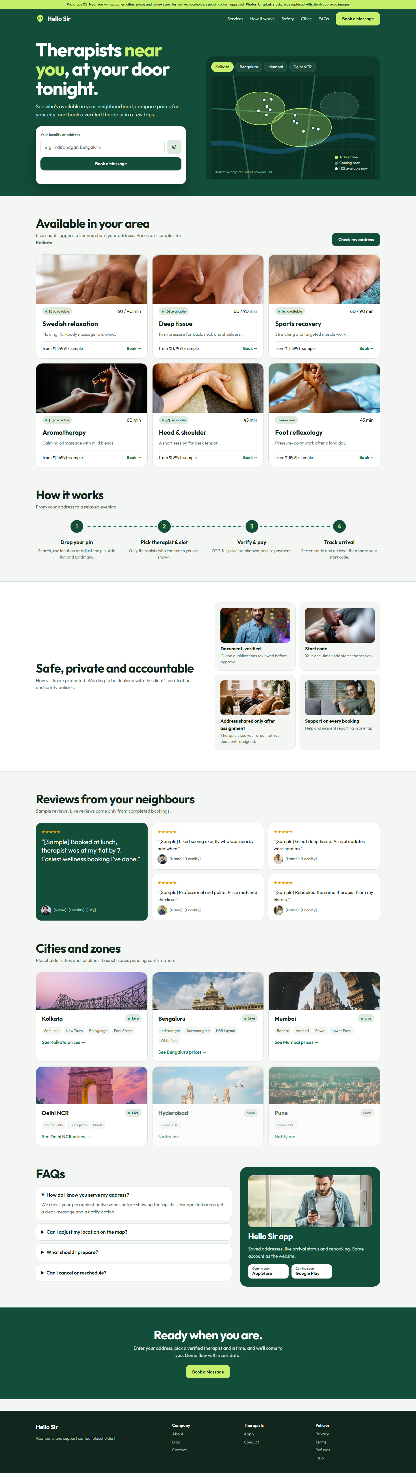
Option 05

Near You

Location-led design with a city switcher and coverage map in the hero, plus per-city zone cards, making serviceability the main message.

Palette
Forest green, lime, sage
Type
Outfit
Booking entry
Address and GPS box beside an illustrative zone map
Best for
Multi-city growth and city landing pages
Option 05 desktop
Desktop
Option 05 mobile
Mobile
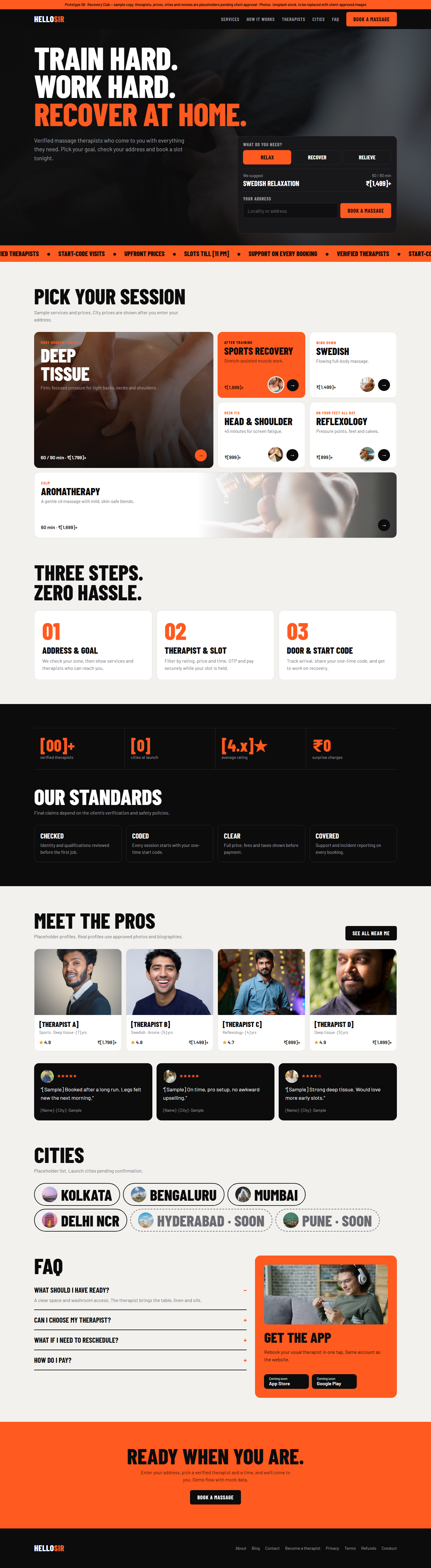
Option 06

Recovery Club

Bold, athletic recovery angle with condensed uppercase type, a goal picker (Relax, Recover, Relieve) and a bento service grid.

Palette
Black, electric orange, off-white
Type
Barlow Condensed + Barlow
Booking entry
Goal tabs that suggest a service, then address
Best for
Fitness-minded, younger working men
Option 06 desktop
Desktop
Option 06 mobile
Mobile

Next step: the client picks one option (or a mix, such as the Option 03 booking panel inside Option 01 styling) and lists requested changes. The full React website starts only after that selection is recorded in docs/decisions.md.